It is the 29th of August 1952, you are lining up to see David Tudor, a promising new pianist. On this sunny day, you’ve decided to stay inside Woodstock’s Maverick Concert Hall, so as not to miss the performance you’ve heard everyone talking about. Your turn arrives: you can take your seat. Then the musician enters, ready to play John Cage’s composition 4’33. The pianist begins by closing the piano lid. At this point, the only sounds coming out of the room are the whispers of people and the squeaking of chairs. After looking at his watch for a while, the musician opened the piano lid again and closed it, thus ending the movement of the first piece. Some people inside began to feel irritated and left the room, as they realized that the piece would have been as noisy at the end as it was at the beginning.
The Wes Anderson style
The grand Budapest Hotel film
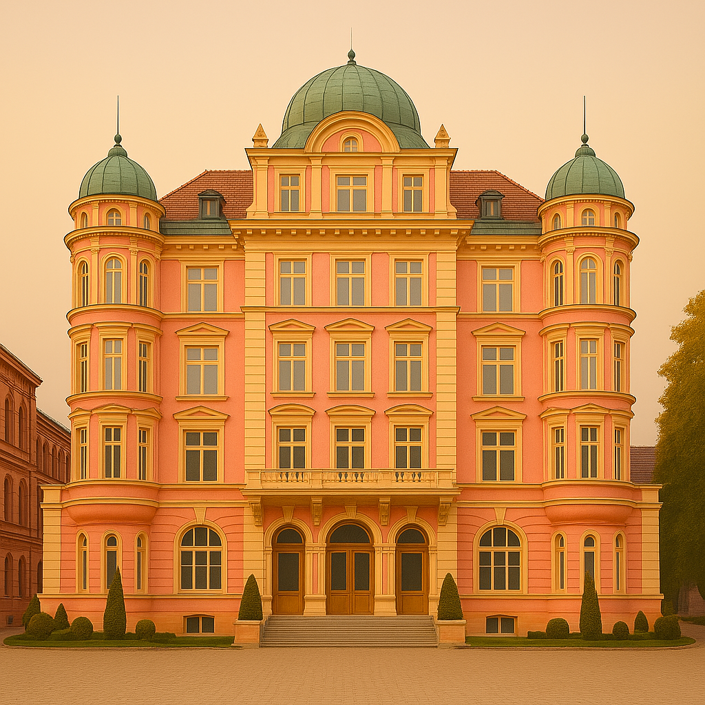
In 2014, Wes Anderson signed The Grand Budapest Hotel, a work immediately recognisable by its meticulous aesthetic, pastel colours and symmetrical framing. The action takes place in a fictional hotel in the heart of an imaginary Europe just before the war. We follow M. Gustave H., a refined and meticulous concierge, and Zero, a shy young apprentice, in an absurd race involving murder, inheritance and Baroque poetry. But beyond the script, it’s the visual style that draws attention. Each shot is constructed as an autonomous image, with a sense of detail pushed to the limit. The setting becomes a character in itself, charged with memory and imagination. Anderson doesn’t film a real world, but a stylised memory, almost suspended in time. This aesthetic choice has had a lasting impact on cinema, advertising, and the world of design, creating an immediately identifiable cultural reference.
The hotel colours
From the opening seconds, The Grand Budapest Hotel imposes a coherent, instantly recognisable visual universe, supported by a carefully composed colour palette. Wes Anderson never chooses a hue at random: each colour tells a story, reinforces a tone, and evokes an emotion. Powder pink and mauve on the hotel’s façade convey an old-fashioned, almost melancholy elegance. Inside, reds and golds evoke the decadent luxury of a fading world. Elsewhere, soft blues and pastel greens soothe, refresh and balance. This chromatic construction transforms each scene into a tableau vivant, where aesthetics not only serve the image but play a full part in the narrative. It’s this visual rigour, both simple and sophisticated, that makes the film a unique object, somewhere between a modern fairy tale and a graphic work of art.
The hotel details
Wes Anderson is known for his rigorous approach to image composition. In The Grand Budapest Hotel, every shot is built around a central symmetry, with clean lines and perfectly aligned elements. This choice gives an impression of order and clarity, reinforced by fluid camera movements, often sideways or travelling, that follow an almost mechanical logic. The hotel, the main setting of the film, is conceived as a place apart, where every piece of furniture, every colour, every object responds to a precise code. Costumes and accessories are also chosen to fit in with this graphic coherence. Nothing stands out, nothing is improvised. This attention to detail creates a special atmosphere, at once controlled and slightly unreal. It’s this combination of visual rigour and whimsical universe that gives the film its instantly recognisable identity.
Silence as a tool for Self-Reflection
The human’s brain aesthetic sense
The human brain processes structure more easily. Faced with a complex visual environment, it instinctively looks for stable reference points, regular shapes and balance. This makes symmetry and harmony naturally attractive. They create an impression of clarity, control, and sometimes even safety. This is not a cultural preference but a cognitive mechanism: a symmetrical object or face requires less processing and is, therefore, more pleasing to the eye. A concrete example: in architecture, a symmetrical, ordered square is perceived as more inviting than a space where nothing seems to line up. Perception studies have also shown that symmetrical faces are perceived as more beautiful because they are subconsciously associated with balance, health, and reliability. This perceptual reflex partly explains the visual power of highly composed works such as those of Wes Anderson.
Jason Briscoe
Colours’ impact on emotions
Colours don’t just decorate a room, they affect the way it feels. Certain shades have a direct effect on our mood and how we perceive our surroundings. Pastel shades – pink, light blue, pale green – often evoke calm, softness, and a kind of light nostalgia. Conversely, intense colours such as red, gold, or violet suggest prestige, energy, or celebration. When a decor combines sharp contrasts, it is more eye-catching and, at the same time, visually structures the space. For example, a room with soft colours and diffused light will be perceived as calming, while a hall decorated with gold and deep tones will give an immediate impression of wealth or celebration. These effects are typically subtle, but they profoundly alter the emotional relationship we have with a place.
Memorable places
Some places are more memorable than others, not because of their function but because of their strong visual identity. A consistent graphic style gives the impression that the space has its logic, a clear purpose. This visual coherence creates a reassuring framework that is easy to recognise and, therefore, easier to remember. When an environment is structured and harmonious, it becomes more than just decoration: it contributes to the experience. For example, the colourful facades of Burano or the Art Deco buildings of Miami have become symbols precisely because they offer a clear, repetitive, familiar aesthetic. The same can be said of a café or a boutique, where every detail of the decoration is carefully considered. These places become landmarks, not just for what they offer, but for the universe they project and the sense of belonging they create.
La Durée, visually memorable company
LaDurée
When visual elegance becomes a signature
Since its creation in 1862, Ladurée has always strived to do more than just sell pastries. From the outset, the brand has associated its macaroons with a refined art of living, inspired by the Parisian salons of the 19th century. The experience is not limited to tasting: it begins as soon as you enter the shop. Pastel colours, mouldings, gilding, illustrated boxes – everything is designed to create a homogeneous, recognisable atmosphere. This attention to image distinguishes each point of sale, where visual elegance becomes a promise of quality. As in The Grand Budapest Hotel, the décor is not incidental: it supports and structures the brand’s identity. This strong aesthetic choice has enabled Ladurée to establish itself internationally, exporting not just a product but a coherent universe where the eye is as important as the palate.
A structured and harmonious visual style
At Ladurée, it’s all about perfectly mastered aesthetics. The famous “vert d’eau” (water green), which has become the house signature, evokes a form of gentle, accessible refinement, reinforced by the regular use of pastel shades and subtle gilding. This palette creates a coherent, immediately identifiable atmosphere, both light and precious. In both boutiques and tearooms, symmetry guides the layout: spaces are balanced, windows are ordered, and products are perfectly aligned. This visual rigour gives an impression of calm, control, almost staging. As in The Grand Budapest Hotel, every element is part of a silent narrative, where visual harmony becomes a promise of elegance. Right down to the packaging, every detail is designed to prolong the experience. This constant care builds a strong visual universe, in which the customer buys not just a product, but a complete and enveloping atmosphere.
The benefits of a strong visual identity
One spring day, a customer enters a Ladurée boutique in Tokyo. She’d never been there before, but everything was familiar: the pastel windows, the boxes stacked like precious objects, the subtle scent of sugar and dried flowers. She recalls a memory of a visit to Paris ten years earlier. This is the power of a mastered visual identity: it transcends place and stands the test of time. Each boutique becomes an extension of the other, as if the décor travels with it. Unlike brands that change their face to keep up with trends, Ladurée stays true to its roots. This aesthetic fidelity ultimately creates a form of trust. Style becomes a memory, a promise of consistency. Like the hotel in Anderson’s film, Ladurée doesn’t have to evolve to remain desirable. Instead, it slowly becomes part of the collective imagination.
A visual recognition
Silence does not impose itself. It appears briefly, in places that allow it, before disappearing again. Sometimes it is structured, like a concert that contains no notes. Sometimes it is suggested, through a screen and a soft voice. At other times, it arrives unexpectedly—between two movements, at the end of a sentence, in the pause before a reply. Its meaning shifts with context, but its presence continues to mark a form of attention. What John Cage heard in an anechoic chamber, what a user may glimpse during a session on their phone, or what someone else experiences alone in a room—all point to the same movement: a turning inward that does not disconnect, but listens. Not all silences are comfortable, nor are they always useful. But they persist, quietly. And in doing so, they remind us that not everything has to be said to be understood. Some things begin where sound ends.