Use a dramatic irony into your communication

Use a dramatic irony into your communication Visual 6 March 2025 Instagram Linkedin Mathilde Pottier Designer & Founder When cinema plays with dramatic irony, it becomes a cruel mirror of power relations. This form of irony – where the audience knows more than the characters – reveals much more than a simple comic relief: it exposes the fragility of a social order based on the illusion of control. Le Dîner de Cons, an adaptation of Francis Veber’s play, is a perfect example of this. Behind its razor-sharp dialogue and absurd situations, the film employs a mechanical inversion. It’s not just one idiot who invites himself to the table but an entire social hierarchy that staggers under the weight of its self-importance. Far from simple vaudeville, the film subtly questions the complacency of the powerful and the blindness of those who believe they are in control. In this sense, it opens up a broader reflection on contemporary social irony: the irony that slips between the discourse of power and the perception of the dominated. A dramatic irony of class in film The wealthy people idiots Paris, early 1990s. In a small theatre on the Left Bank, a play catches the eye: Le Dîner de Cons, written by Francis Veber. The idea is simple, cruel, almost absurd: every Wednesday, a group of wealthy men organise a dinner party where each brings an “idiot” to make fun of. But this time, the trap slowly and methodically backfires. In 1998, Veber himself adapted his play for the screen. He reunited with Jacques Villeret, already unforgettable on stage, to play François Pignon opposite Thierry Lhermitte. It was an immediate success. The comedy is based on dramatic irony: the audience knows what the characters don’t, and each clumsy mistake tips the balance. The idiot becomes lucid, the cynic loses his footing. On screen, every detail counts: a stuck back, a phone call, a missed train. Le Dîner de Cons is not a farce. It’s a game of masks that always falls in the end. Loosing control Everything is in place from the very first minutes. Pierre Brochant’s back hurts, but not his ego. He believes he has a perfectly controlled evening in his hands. In contrast, François Pignon appears harmless, clumsy, and almost pathetic. But the audience sees something else. They can already see Brochant’s fragile arrogance, his need to dominate, to reassure himself. Above all, they can see that Pignon, without wanting to, will turn everything upside down. This constant discrepancy – between what the characters know and what we know – creates a constant comic tension. Every misunderstanding, every misinterpreted silence, and every phone call becomes another part of an absurd spiral. Dramatic irony is not just one source among many; it’s the heart of the show. It allows the comedy to go beyond easy laughs by highlighting what social complacency often refuses to see: the vulnerability of those who believe they have everything under control. Where the absurd comes from In Le Dîner de Cons, laughter never comes alone. When the roles are reversed, another reading emerges. Pierre Brochant, a self-confident publisher, embodies a form of bourgeois self-importance: he judges, classifies and organises. François Pignon, a model-making enthusiast, enters the play as an easy distraction. But every attempt at manipulation fails. The “idiot” gets in the way, insists, means well – and destroys everything without ever understanding why. The audience laughs, but the laughter slips away: it becomes a way of questioning contempt, condescension and the gentle violence of social relations. The dramatic irony here reveals more than a simple comic reversal: it exposes the very idea of superiority. In the end, Brochant loses his hand, his voice, and his face. Pignon, on the other hand, remains on his feet. Not because he won, but because he never played. That’s where Veber hits the nail on the head. The leaders dramatic irony Those with power Dramatic irony is not confined to fiction. In social life, it manifests itself when those in power fail to see what others perceive. A phrase, a posture, or a public speech can reveal a profound discrepancy between intention and reality. The spectator – or in this case, the citizen – witnesses a scene where arrogance is unaware of itself. The effect is often striking. A leader who defends meritocracy, asserting that everyone can succeed ‘if they have the will’, sometimes ignores everything about the real conditions of access to success. Not out of malice, but out of disconnection. The public, on the other hand, perceives the abyss: the invisible obstacles, the absent networks, the early breaks. There’s nothing comical about this form of irony. It makes visible a social blindness – that of the dominant, who speak in the name of a universe whose limits they do not measure. Kelly Sikkema The gap with the audience Powerful individuals sometimes speak confidently about the world, believing they are describing a shared reality. But what they say often reflects their trajectory, not that of the majority. This creates a form of dramatic irony: the discrepancy between what the speaker believes and what the audience perceives. This phenomenon is common in public speeches, media appearances and management advice. The intention may be sincere, but the vision remains limited, filtered through a sheltered life experience. When a manager says that ‘young people don’t want to work anymore’, he forgets the concrete conditions: split working hours, low wages, inaccessible housing, and precarious contracts. Blindness is not only a question of ignorance but also of position. Those who control the stories sometimes forget to look down. And those who listen can hear exactly what’s wrong. The discrepancy moments Power sometimes gives the illusion of stability. Certain dominant groups come to believe that their position is established, rational, almost natural. They think they can control their environment, anticipate risks and foresee crises. And yet this is often where the irony comes in: when perceived security reveals its cracks. This discrepancy comes to the fore
How flashforwards can convey your company messages?

How flashforwards can convey your company messages? Visual 6 March 2025 Instagram Linkedin Mathilde Pottier Designer & Founder What if you knew what was going to happen tomorrow? This was the starting point for Early Edition (1996-2000), a cult series from the 90s in which Gary Hobson, an ordinary man, receives a tomorrow’s paper every morning. Announcements of accidents, fires, tragedies to come: each edition gives him 24 hours to act. But this capacity for anticipation is not a superpower. Gary has no total control and no certainties. He acts blindly, on the basis of a hypothetical future, in an uncertain present. This flashforward mechanism – seeing before acting – opens up a wider area for reflection: what would we do if we knew? And what does this projection of the future reveal about the way we make decisions today? Between fictional accounts, cognitive biases and innovation strategies, Early Edition becomes a gateway to a wider question: what does it mean to anticipate – personally, morally and collectively? Early edition, the flashforward serie Gary Hobson daily life Chicago in, late 90s. Every morning at dawn, Gary Hobson discovers a newspaper that no other citizen can read: tomorrow’s paper. Delivered to his doorstep by a mysterious cat, this daily newspaper from the future announces accidents, crimes, and disasters. And he has 24 hours to act. Gary is neither a hero nor a scientist, just an ordinary man faced with an extraordinary responsibility. Unlike classic time travel stories, he can’t replay the game. He only gets one chance each time. This simple but effective narrative framework allows the series Tomorrow on the Front Page (Early Edition, 1996-2000) to explore moral and human dilemmas between urgency and uncertainty. Each episode becomes a variation on the same starting point: what do you do when you know what’s going to happen – and you can neither forget it nor avoid it? The flashforward construction Each episode of Early Edition follows an almost unchanging pattern. The next day’s paper arrives, revealing an accident, a murder, a fire. Gary reads it, understands the urgency and sets off. The flash-forward serves as a starting point but never as a guarantee. What he reads is one possible version of the future – it’s up to him to counter it. He investigates, tries to understand the context, and identifies the people involved. But his attempts don’t always lead to the expected result. A gesture too soon, a word misinterpreted, and the situation gets worse. In one episode, he tries to prevent a fire: by intervening too soon, he creates panic and makes the danger worse. The structure shows that knowing the future is not the same as controlling it. Every intervention poses a dilemma. The real tension comes not from the ‘what’ but from the ‘how’ – and at what cost. The flashforward consequences Receiving tomorrow’s newspaper every morning is not a quiet gift. For Gary Hobson, it’s an accumulating burden. Every headline, every article, foretells misfortune to come. He soon realises that to do nothing is to accept that these tragedies will happen. But taking action carries its risks. A poorly calibrated decision, a move too soon, too late, and the future is rearranged – sometimes for the worse. Gary lives in a moral limbo: guilty if he doesn’t act, responsible if he does. This constant tension leads to isolation, doubt and moral fatigue. He can’t share what he’s going through. Even those closest to him remain distant, unable to understand. In some episodes, the dilemma becomes personal: should he save someone close to him at the risk of sacrificing others? The show doesn’t always answer this question. But it does raise a haunting question: Can we control the future? The flashforwards influence on decision-making Optimism bias: an idealized future In our minds, the future is often easier than it will be. The optimism bias leads us to believe that everything will be fine, that we will be more efficient, more organised, more lucid than we are today. This mental mechanism has its virtues: it encourages us to move forward, to take action. But it can also blind us by minimising the real obstacles. A student who is convinced that he or she will have “time to revise” puts off work without worrying until the deadline arrives, unprepared. An entrepreneur starts a project on the assumption that each stage will be completed without delay or error, only to see his timetable explode at the first complication. In both cases, the imagined future becomes a deceptive refuge. It’s not just a matter of hope but of a distorted mental construction that transforms the personal flash-forward into an idealised scenario, more flattering than plausible. Jr Korpa Catastrophic bias: an anxiety-inducing flash forward Imagining the future can be motivating, but it can also be inhibiting. Some people systematically project the worst possible scenario to the point of locking themselves into it. This catastrophic bias is often the result of poorly digested negative experiences. It instils the idea that every past failure is a harbinger of a failed future and that every attempt is too risky. For fear of shame, disappointment or failure, action is postponed and then avoided. Someone refuses to speak in public because they are convinced they stammer – when in fact the mistake is minimal and quickly forgotten. Another person turns down a job for fear of not being up to the job, even though they have solid skills. This anxiety-provoking flashback doesn’t anticipate; it prevents. By preparing for the fall, we stop trying to climb. The future becomes a minefield, not because it’s dangerous, but because we imagine it’s already lost. The illusion of control: the belief of controllable future Imagining the future also means trying to tame it. The illusion of control leads us to believe that everything can be anticipated, regulated and secured by our will alone. This bias is comforting but deceptive. It forgets that the future also depends on external, often uncontrollable variables.
Transform your company in Grand Budapest Hotel
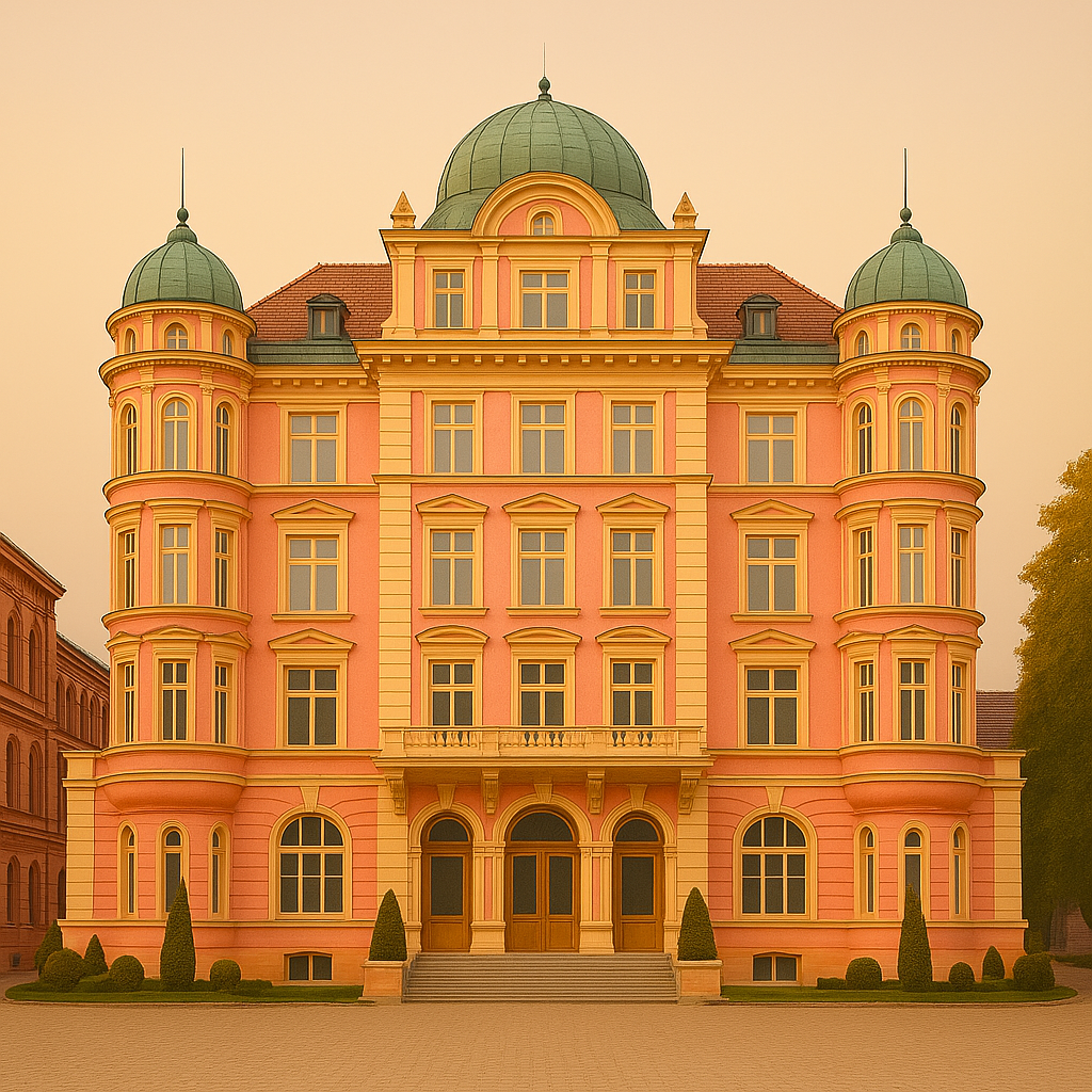
Transform your company in Grand Budapest Hotel Visual 3 March 2025 Instagram Linkedin Mathilde Pottier Designer & Founder It is the 29th of August 1952, you are lining up to see David Tudor, a promising new pianist. On this sunny day, you’ve decided to stay inside Woodstock’s Maverick Concert Hall, so as not to miss the performance you’ve heard everyone talking about. Your turn arrives: you can take your seat. Then the musician enters, ready to play John Cage’s composition 4’33. The pianist begins by closing the piano lid. At this point, the only sounds coming out of the room are the whispers of people and the squeaking of chairs. After looking at his watch for a while, the musician opened the piano lid again and closed it, thus ending the movement of the first piece. Some people inside began to feel irritated and left the room, as they realized that the piece would have been as noisy at the end as it was at the beginning. The Wes Anderson style The grand Budapest Hotel film In 2014, Wes Anderson signed The Grand Budapest Hotel, a work immediately recognisable by its meticulous aesthetic, pastel colours and symmetrical framing. The action takes place in a fictional hotel in the heart of an imaginary Europe just before the war. We follow M. Gustave H., a refined and meticulous concierge, and Zero, a shy young apprentice, in an absurd race involving murder, inheritance and Baroque poetry. But beyond the script, it’s the visual style that draws attention. Each shot is constructed as an autonomous image, with a sense of detail pushed to the limit. The setting becomes a character in itself, charged with memory and imagination. Anderson doesn’t film a real world, but a stylised memory, almost suspended in time. This aesthetic choice has had a lasting impact on cinema, advertising, and the world of design, creating an immediately identifiable cultural reference. The hotel colours From the opening seconds, The Grand Budapest Hotel imposes a coherent, instantly recognisable visual universe, supported by a carefully composed colour palette. Wes Anderson never chooses a hue at random: each colour tells a story, reinforces a tone, and evokes an emotion. Powder pink and mauve on the hotel’s façade convey an old-fashioned, almost melancholy elegance. Inside, reds and golds evoke the decadent luxury of a fading world. Elsewhere, soft blues and pastel greens soothe, refresh and balance. This chromatic construction transforms each scene into a tableau vivant, where aesthetics not only serve the image but play a full part in the narrative. It’s this visual rigour, both simple and sophisticated, that makes the film a unique object, somewhere between a modern fairy tale and a graphic work of art. The hotel details Wes Anderson is known for his rigorous approach to image composition. In The Grand Budapest Hotel, every shot is built around a central symmetry, with clean lines and perfectly aligned elements. This choice gives an impression of order and clarity, reinforced by fluid camera movements, often sideways or travelling, that follow an almost mechanical logic. The hotel, the main setting of the film, is conceived as a place apart, where every piece of furniture, every colour, every object responds to a precise code. Costumes and accessories are also chosen to fit in with this graphic coherence. Nothing stands out, nothing is improvised. This attention to detail creates a special atmosphere, at once controlled and slightly unreal. It’s this combination of visual rigour and whimsical universe that gives the film its instantly recognisable identity. Silence as a tool for Self-Reflection The human’s brain aesthetic sense The human brain processes structure more easily. Faced with a complex visual environment, it instinctively looks for stable reference points, regular shapes and balance. This makes symmetry and harmony naturally attractive. They create an impression of clarity, control, and sometimes even safety. This is not a cultural preference but a cognitive mechanism: a symmetrical object or face requires less processing and is, therefore, more pleasing to the eye. A concrete example: in architecture, a symmetrical, ordered square is perceived as more inviting than a space where nothing seems to line up. Perception studies have also shown that symmetrical faces are perceived as more beautiful because they are subconsciously associated with balance, health, and reliability. This perceptual reflex partly explains the visual power of highly composed works such as those of Wes Anderson. Jason Briscoe Colours’ impact on emotions Colours don’t just decorate a room, they affect the way it feels. Certain shades have a direct effect on our mood and how we perceive our surroundings. Pastel shades – pink, light blue, pale green – often evoke calm, softness, and a kind of light nostalgia. Conversely, intense colours such as red, gold, or violet suggest prestige, energy, or celebration. When a decor combines sharp contrasts, it is more eye-catching and, at the same time, visually structures the space. For example, a room with soft colours and diffused light will be perceived as calming, while a hall decorated with gold and deep tones will give an immediate impression of wealth or celebration. These effects are typically subtle, but they profoundly alter the emotional relationship we have with a place. Memorable places Some places are more memorable than others, not because of their function but because of their strong visual identity. A consistent graphic style gives the impression that the space has its logic, a clear purpose. This visual coherence creates a reassuring framework that is easy to recognise and, therefore, easier to remember. When an environment is structured and harmonious, it becomes more than just decoration: it contributes to the experience. For example, the colourful facades of Burano or the Art Deco buildings of Miami have become symbols precisely because they offer a clear, repetitive, familiar aesthetic. The same can be said of a café or a boutique, where every detail of the decoration is carefully considered. These places become landmarks, not just for what they offer, but for the universe they